
|
Does beginning a piece confuse you? The Rule of Thirds is a method I use in many ways to begin a painting. Not only that, I need only remember the number three to prompt my brain! In art, the Rule of Thirds, is a general guideline for how to create an interesting composition which states that any image--painting, photograph, graphic design—should be broken into a grid with two vertical and two horizontal lines, creating nine equally proportioned boxes. Whether you know the rule of thirds or just would like a refresher, here are some thoughts. I not only use the Rule of Thirds for composition, but for value and color. Three Uses for the Rule of Thirds Composition: As stated above, try beginning work by dividing your new work into sections of three: 3 down, 3 across. There are now 9 boxes, like a tic tac toe board. When creating the composition, your story - what that piece is about, what you want your viewer to notice - can lie at a point of intersection on the grid. Important sections in the composition can follow the grid lines. Also notice the upper gridline and the diagonal very near that lower line. Here's Van Gogh demonstrating that a tree is the focal point, at an intersection, for his painting. 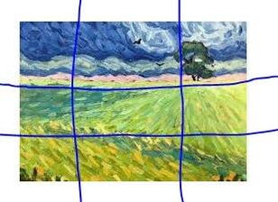 Value: The lights and darks, or values of a piece, are the bones of the composition. Everything else is carried on that skeleton. When first deciding on the values, three is enough. Dark, midtone, light. Three values. Consider a landscape. Foreground, dark, the land itself, midtone, and the sky, lightt. Consider a portrait. Background light, face midtone, clothing dark. Of course there will be more sections. But start with three. TIP: If you are working in color, and can take a look at your work in grayscale, you will see which areas to modify. Using Van Gogh's painting once again, can we see the three values? Darks, midtones, and lights? Squint your eyes for a better look. Look also at the way the tones direct your eyes toward the tree. 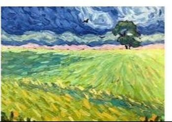 Color: When considering a palette, simplify first, by using the Rule of Thirds. One color is dominant, another is secondary the third is your accent color, used sparingly. Let's name the colors below: Dominant: Yellow; Secondary: Blue; Accent: Pink. Although there are mixes of the colors named, you will note there are ratios of these three colors. Most of the painting is a yellow-green, the next color you see is blue, and the accent is a touch of pink.  All rules are made to broken or expanded upon; however, the rule of three is great way to organize and start a work.
0 Comments
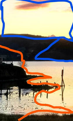
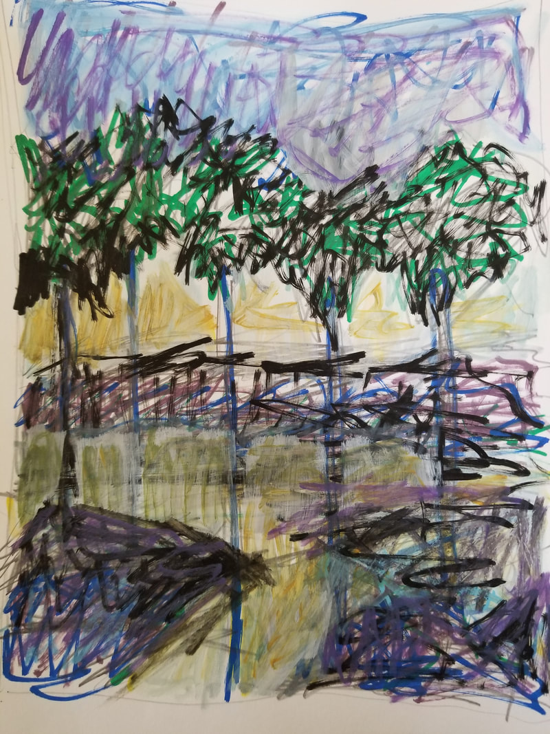
I almost always start a work with a reference photo. However, If I'm impatient or lazy, and I'm both at times, I may choose a photo with a weak composition. Rather than taking the time to think, I'll dive right in to my art process. And in this way, I make my greatest mistake, and may need some help. MY GREATEST MISTAKE - STARTING WITH A WEAK COMPOSITION This is what I call "my greatest mistake." I too frequently begin with a weak composition rather than take the time to think through where I want the work to go. In my process, all good work starts and ends with a strong composition. In my art practice, I consider the development of composition and values - especially lights and darks - as the bones of a good painting. All the technique and color in the world is icing on the cake. It won't save a compositionally poor work. (For more on establishing composition, visit my YouTube Channel at MarcyFineArt.) If I'm bumbling around in a work, I know I'm struggling with a weak composition. However, my media give me an advantage. By using acrylic and pen, I'm free at any time to strengthen the the piece quickly by drawing a new composition right over the old. I may actually simply scribble in shapes and make them into an object to make the composition work. HOW TO GET INSTANT HELP When you are in trouble, who ya gonna call? Well, in art, not ghostbusters. When I need help, I call on the best - The Great Masters. I google the works of my favorite painters and visually ask them questions about where my painting should go. My favorite painters belong to a group called the Nabis: Gaugin, Bonnard, Vuillard. As I look at their works, I ask questions of myself like: Does this piece look like mine? Are the shapes similar? The colors? How do they handle a similar composition? And with those questions visually answered, I improve my work. THE GOOD AND THE BAD OF THIS SOLUTION There are both positives and negatives to this process. First, I may have to abandon my beginning composition; next, I am risking that I'll be able to strengthen not only these bones, the structure of the painting, but that the entire painting itself will retain what I hoped it would be. Let's take a look at how this process played out today. The Process This is my reference photo. I know going in that the composition in the upper 1/4 of the photo is weak.
Step 1. As I look at this photo, I see shapes that work those traced by the orange line. However the top quarter, outlined in blue, needs work. A good composition is a path that helps your eye travel around the painting.
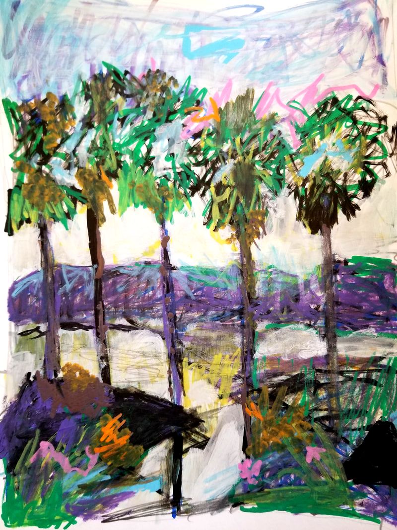
Great Master's to the Rescue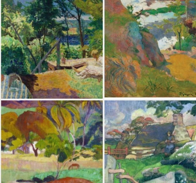 GREAT MASTERS TO THE RESCUE! In the pieces above, I have invited Gaugin and Bonnard to show me some work. These are only sections of their paintings. I notice the flowing shapes and the colors that are similar to the piece I'm creating. Although my piece becomes nothing like theirs, I learn from looking at their placement of colors and the flow - the compositional path - around the piece of art. I watch myself as I continue, because I really don't want to emulate their precision of shapes in my piece. I want to keep my own sketchy style. 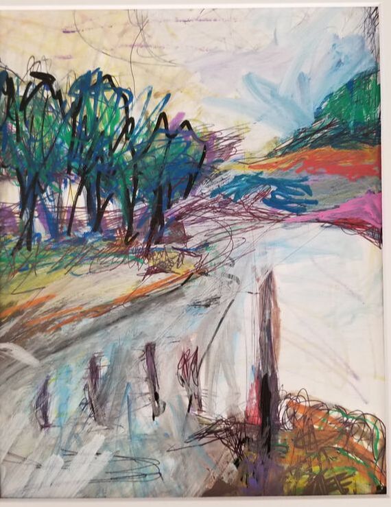 Confession: I have a visual problem. One eye is nearsighted, the other farsighted! My right eye wants to ignore the right side of my work. So I study the balance in the master's paintings. As you notice, I work to strengthen a shape on the right side. Take a look at your work. Is there some area that always feels weak? It's good to know. 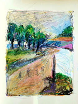 This was a two hour sketch. It's still unfinished as a piece of art. That right side still gives me problems. However, as I compare it to my reference photo, I'm happy with today's results. My time wasn't wasted thanks to asking for help when I needed it from my favorite painters. Do you have common problems with your paintings or drawings?
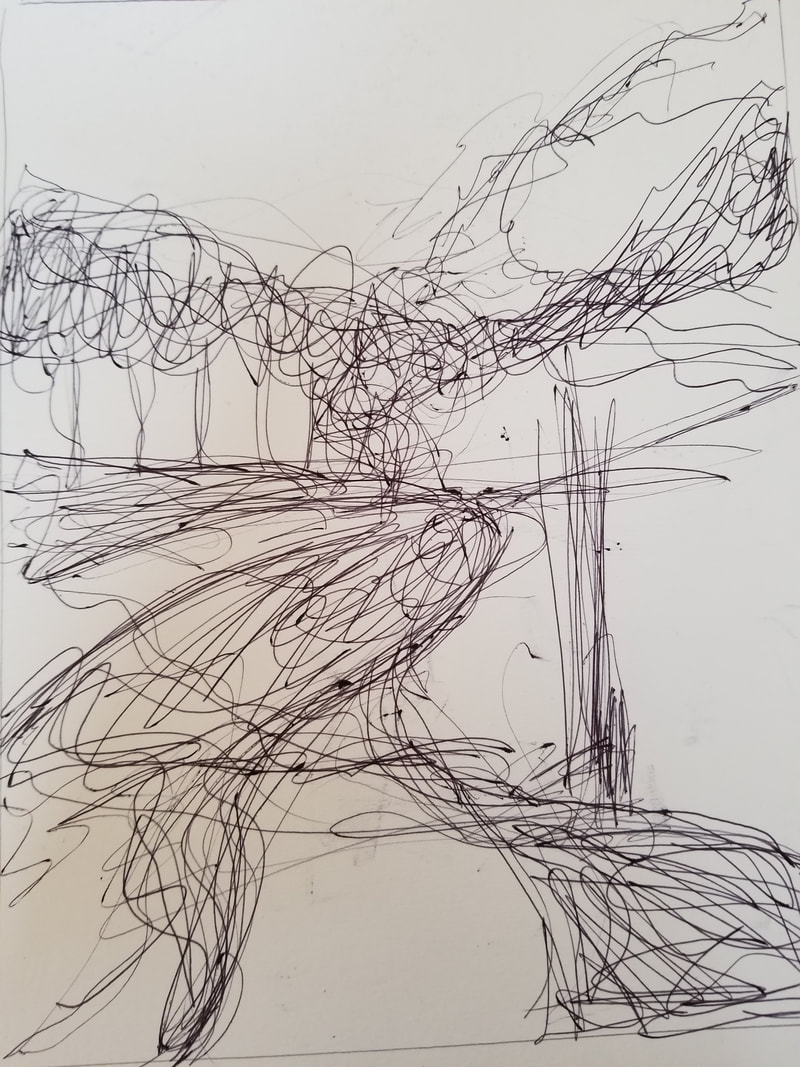
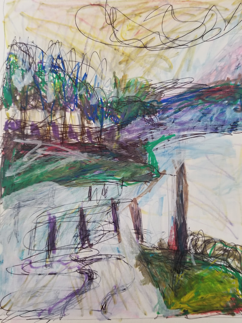
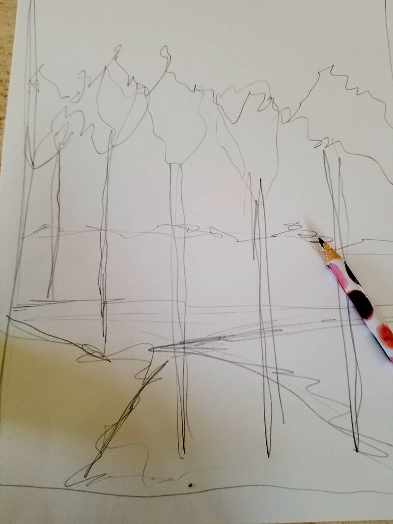
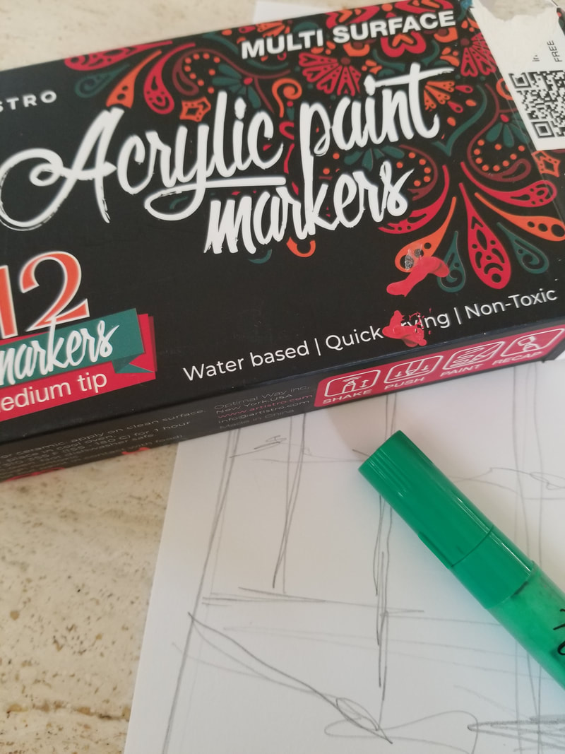
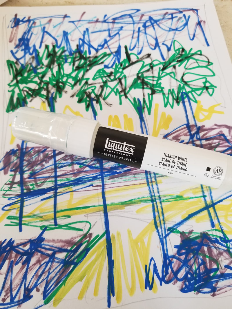
Art relaxes me. Today is January 7, 2021, and I need to relax. For a much more in-depth look at how I use these tools, both pencil and markers, visit my YouTube channel at MarcyFineArt. There are tutorials on basic drawing and how to use the markers to go over the pencil. This post is to encourage you to try quick sketches on your own! There is no real magic, only experimentation on how these media blend. I'd like to show you how I use my markers and a pencil, to just have at it. I'm going to show you a quick sketch. Below are photographs of a one hour sketch using marker and a graphite pencil. I simply go back and forth layering one over the other until I feel like the sketch is complete. For a blending tool, I use a broad-tipped white acrylic marker. I may refine this sketch further or not. I'm using a reference photo I took of a sunset, yet I'm choosing colors that I enjoy. The entire purpose of my quick sketches are to enjoy myself. My goal with this post is to encourage you to play with these media in the same way. Acrylic markers make it possible for you to express yourself and quickly revise a piece of work until your are finished or just want to toss it in the wastebasket. I do both. You'll find as you try these quick sketches you learn to use these media in spite of yourself. The only hint: have on hand a broad tipped white acrylic marker. This marker blends with the pencil, any of the markers, or you can use it opaquely over any area for revision. So, I invite you to have at it!
https://youtu.be/huQ9ViAdKkk Click on the link above for a 5-minute video showing how I combine marker and colored pencil for this quick sketch image. Give it a try! Find all my Tutorials on my MarcyFineArt YouTube Channel. 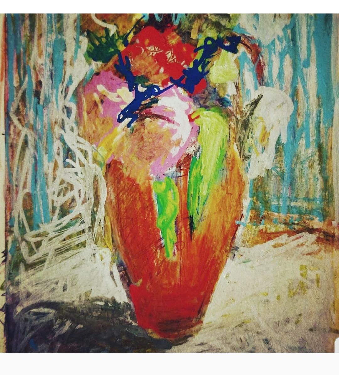 |
Marcy Orendorff Fine ArtArt techniques Archives
February 2021
Categories |


 RSS Feed