
|
Does beginning a piece confuse you? The Rule of Thirds is a method I use in many ways to begin a painting. Not only that, I need only remember the number three to prompt my brain! In art, the Rule of Thirds, is a general guideline for how to create an interesting composition which states that any image--painting, photograph, graphic design—should be broken into a grid with two vertical and two horizontal lines, creating nine equally proportioned boxes. Whether you know the rule of thirds or just would like a refresher, here are some thoughts. I not only use the Rule of Thirds for composition, but for value and color. Three Uses for the Rule of Thirds Composition: As stated above, try beginning work by dividing your new work into sections of three: 3 down, 3 across. There are now 9 boxes, like a tic tac toe board. When creating the composition, your story - what that piece is about, what you want your viewer to notice - can lie at a point of intersection on the grid. Important sections in the composition can follow the grid lines. Also notice the upper gridline and the diagonal very near that lower line. Here's Van Gogh demonstrating that a tree is the focal point, at an intersection, for his painting. 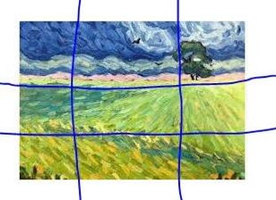 Value: The lights and darks, or values of a piece, are the bones of the composition. Everything else is carried on that skeleton. When first deciding on the values, three is enough. Dark, midtone, light. Three values. Consider a landscape. Foreground, dark, the land itself, midtone, and the sky, lightt. Consider a portrait. Background light, face midtone, clothing dark. Of course there will be more sections. But start with three. TIP: If you are working in color, and can take a look at your work in grayscale, you will see which areas to modify. Using Van Gogh's painting once again, can we see the three values? Darks, midtones, and lights? Squint your eyes for a better look. Look also at the way the tones direct your eyes toward the tree. 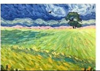 Color: When considering a palette, simplify first, by using the Rule of Thirds. One color is dominant, another is secondary the third is your accent color, used sparingly. Let's name the colors below: Dominant: Yellow; Secondary: Blue; Accent: Pink. Although there are mixes of the colors named, you will note there are ratios of these three colors. Most of the painting is a yellow-green, the next color you see is blue, and the accent is a touch of pink.  All rules are made to broken or expanded upon; however, the rule of three is great way to organize and start a work.
0 Comments
Your comment will be posted after it is approved.
Leave a Reply. |
Marcy Orendorff Fine ArtArt techniques Archives
February 2021
Categories |
 RSS Feed